The New York Times Chronicle sub-site is a wonderful utility that graphs the frequency of words and phrases over the publication’s history. Users can plug in whatever search terms they wish, and the engine instantly and amazingly checks over a century’s worth of content.
Keeping in mind that there are simply more articles today than there were in, say, 1878, it’s particularly interesting to see how certain concepts and ideas have become more or less prominent over the decades.
With that in mind, here, in one chart, is a visualization of the decline of the United States of America.
Ok, maybe two charts:


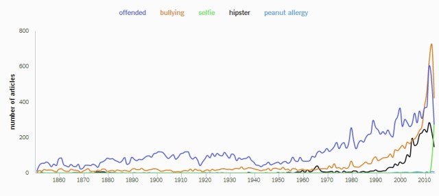
The Decline of the United States of America in One Chart
The New York Times Chronicle sub-site is a wonderful utility that graphs the frequency of words and phrases over the publication’s history. Users can plug in whatever search terms they wish, and the engine instantly and amazingly checks over a century’s worth of content.
Keeping in mind that there are simply more articles today than there were in, say, 1878, it’s particularly interesting to see how certain concepts and ideas have become more or less prominent over the decades.
With that in mind, here, in one chart, is a visualization of the decline of the United States of America.
Ok, maybe two charts:
Share this:
Related